Module 2 • Lesson 2🎬 Grading with Curves, Gradient Maps & LUTs
Color grading is where a correct photo becomes a photo with a mood. In the intro you met the S-curve; now you will build full cinematic looks with per-channel Curves and gradient maps, then bottle a look as a LUT you can pour over an entire shoot in one click.
📚 What You'll Learn
By the end of this lesson, you will be able to:
- Grade with per-channel Curves for precise color in shadows, mids, and highlights
- Use a Gradient Map to remap tones to a color ramp
- Apply and save a LUT (Color Lookup) to reuse a grade consistently
- Keep the whole grade non-destructive and dialable
⏱️ Estimated Time: 60 minutes
🎯 Project: Build a cinematic grade on a scene, then export it as a LUT and prove it drops onto a different photo.
In This Lesson
🎞️ The Goal: A Look, Not Just a Fix
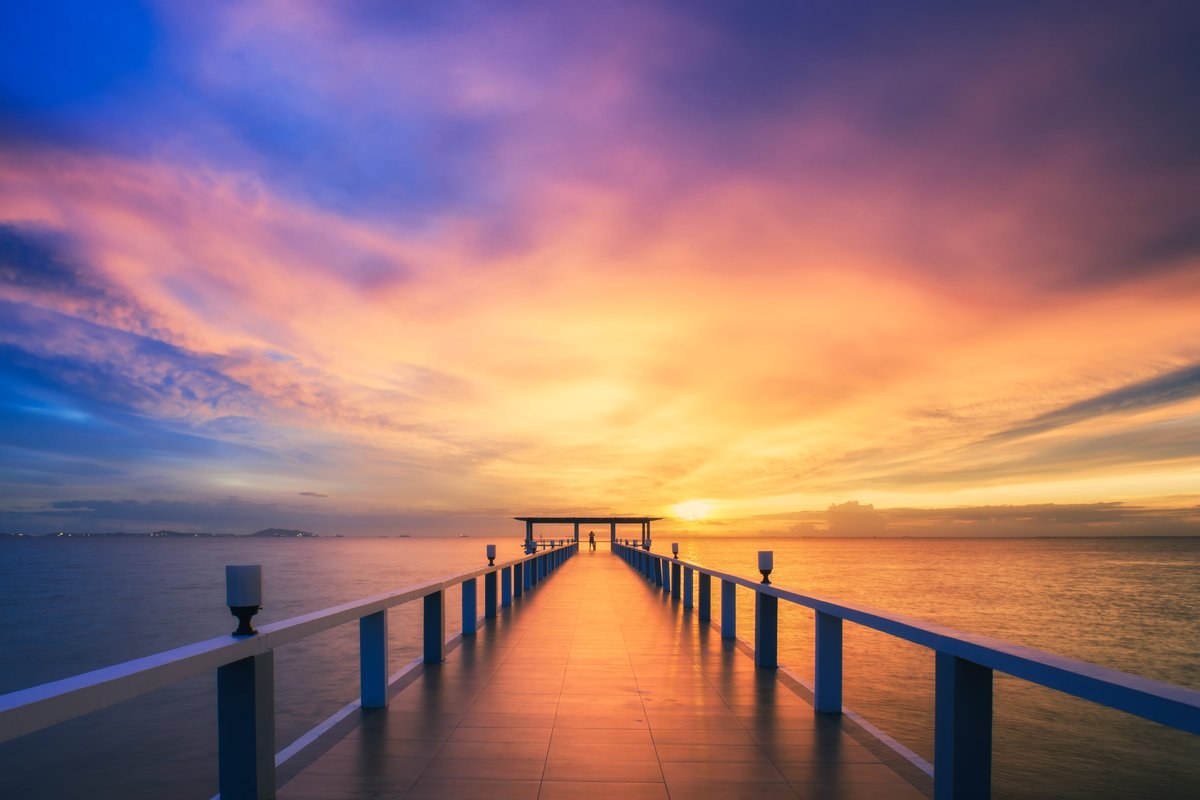
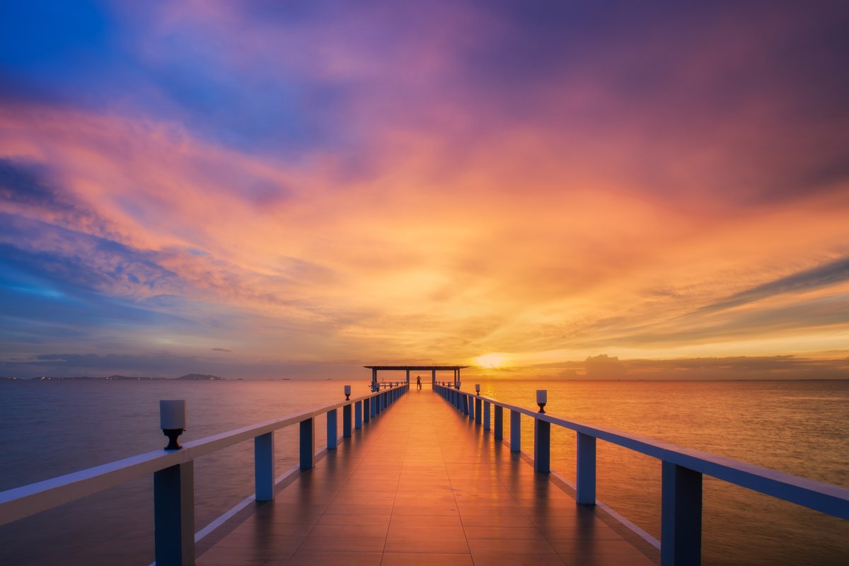
The same pier at sunset, straight out of camera on the right and cinematically graded on the left: deeper teal water and sky, richer contrast, a unified mood. Drag the handle:
🧠 Mental Model: Remapping Color
Correcting an image asks "what is wrong?" Grading asks "what should it feel like?" Technically, every grade is a remap: you decide what color each tone becomes. Shadows do not have to stay neutral; you can send them teal. Highlights can lean gold. That deliberate reassignment is the whole art.
Three tools do the remapping, from most surgical to most sweeping:
- Per-channel Curves — the precision instrument. Bend the Red, Green, or Blue curve in the shadows or highlights to push exact color into exact tones.
- Gradient Map — map the whole tonal range onto a chosen color ramp at once. Fast, bold, great for stylized looks.
- LUT (Color Lookup) — a saved recipe of a finished grade you can re-apply instantly to any image.
🧠 The spiral from the intro
You already S-curved for contrast and split the Blue channel for teal-and-orange. This lesson formalizes that into a repeatable grading craft and, crucially, teaches you to save the look so it is not a one-off you can never reproduce.
🌗 Gradient Maps
A Gradient Map takes your image's tones and replaces them with the colors of a gradient: the darkest pixels get the gradient's left color, the brightest get its right color, everything else in between. Choose a teal-to-gold gradient and you have an instant cinematic split-tone.
⚠️ Blend it, don't bake it
At 100% Normal a Gradient Map looks garish and kills detail. Drop the opacity to 15–40%, or switch the layer to Color or Soft Light, so it lends its palette to the real image underneath.
🧴 LUTs: Bottling a Grade
A LUT (Look-Up Table, a .cube or .3dl file) is a saved recipe that says "turn this input color into that output color," for every color. Build a grade you love, export it as a LUT, and you can pour the exact look onto a hundred other photos, or hand it to a teammate. Apply one with a Color Lookup adjustment layer:
.cube.🛠️ Guided Build: Grade & Bottle It
Open an image in your Lesson 2.1 pipeline (16-bit, deliberate working space) and correct it to a neutral base first: fix exposure and white balance with a Curves adjustment layer. Keep the photo itself as a plain Background layer (not a Smart Object with Camera Raw Filter): the LUT export in Step 4 expects a Background layer plus adjustment layers. A portrait is ideal, because Lesson 2.3 split-tones this same file. Save as grade-working.psd, then grade in this order.
Step 1: Contrast, then color · 10 min
- Add a Curves layer and set your contrast with a gentle RGB S-curve.
- New Curves layer. Switch to the Blue channel: lift the shadow end (blue shadows), drop the highlight end (warm, yellow highlights). Blue alone gives blue/yellow; for a truer teal, also lift Green slightly or drop Red slightly in the shadows. This is the classic teal-and-gold in Curves.
Step 2: A Gradient Map accent · 8 min
- Add a Gradient Map with a teal-to-gold ramp.
- Set the layer to Color or Soft Light and drop opacity to ~20–30% so it unifies the palette without flattening.
Step 3: Refine locally · 6 min
- Grades rarely suit every part of a frame. Mask a Curves or the Gradient Map layer (Module 1 skills) so, say, skin stays natural while the background goes moody.
- A luminosity mask (Lesson 1.1) is perfect for keeping the grade out of the brightest highlights.
Step 4: Bottle it as a LUT · 6 min
- Save your graded master (
grade-working.psd) first; Lesson 2.3 reopens it. - The export bakes every visible adjustment layer, not just the selected ones, and a LUT cannot store a mask. So temporarily disable the Step 3 masks (Shift-click each mask thumbnail) and hide anything that is not part of the grade. Adobe's documentation describes the export for a document with a Background layer plus adjustment layers, so keep that structure. Then choose File ▸ Export ▸ Color Lookup Tables, save a
.cube, and re-enable the masks afterward. - Open a different photo, add a Color Lookup layer, load your LUT, and watch the whole look transfer. That is your grade, now reusable forever. 🏆
✅ Why bottle it
A LUT is how a look becomes a brand: the same feel across an entire shoot, a client's whole feed, or a team's output. Building the grade is craft; saving it is professionalism.
✅ Project Completion Checklist
- ☐ Contrast set before color
- ☐ Color graded with per-channel Curves
- ☐ A Gradient Map used at reduced opacity / a blend mode
- ☐ Grade refined with at least one mask
- ☐ Look exported as a LUT and re-applied to a second image
- ☐ Graded master saved as
grade-working.psdfor Lesson 2.3
🧗 Now You: Solo Variation
🌟 Your challenge
- Build three distinct LUTs: a warm-summer look, a cold-thriller look, and a faded-matte look. Apply each to the same photo to feel how much mood is pure color.
- Reverse-engineer a film still or a favorite photo: name its shadow color and highlight color, then recreate it with per-channel Curves.
- Apply one of your LUTs across five different photos and note where it needs per-image tweaking. A LUT is a starting point, not a finisher.
Going further: stack a subtle Gradient Map under a Color Lookup and mask both — layered grading is how the richest looks are built.
🍳 Recipe Card: Cinematic Grade
Build a look and save it
- Curves: contrast (RGB S-curve) first
- Curves per channel: teal shadows, warm highlights (Blue channel split)
- Gradient Map (teal→gold) at ~20–30% / Color blend
- Mask locally (luminosity or subject masks)
- Save the master; disable masks, then File ▸ Export ▸ Color Lookup Tables → reuse as a
.cube
Mantra: correct, then grade, then bottle.
📓 Learning Journal
Add to your journal after this lesson:
- Key concepts you learned
- Techniques that clicked for you
- Questions or confusion points to revisit
- Ideas you want to try
- Your progress and feelings about learning this
✍️ This lesson's prompt: Describe the "look" you are drawn to as an editor in terms of shadow color, highlight color, and contrast. Naming your taste is the first step to building it into a LUT.
📝 Lesson Summary
🎓 Key Takeaways
- Grading is deliberate color remapping: tones become chosen colors.
- Per-channel Curves are the precision tool; Gradient Maps are the fast, bold one.
- Blend a Gradient Map (low opacity / Color mode); never bake it at 100%.
- Save a look as a LUT to reuse it across a shoot or a brand.
🎉 What You've Accomplished
You can now author a look, not just fix an image — and, just as importantly, save it so it is repeatable. That combination of taste plus reusability is exactly what studios and clients pay for.
❓ Common Questions at This Stage
Gradient Map vs a LUT — when do I use which?
A Gradient Map is a live tool you build inside one document. A LUT is a saved, portable file. Often you build a look with Curves + Gradient Maps, then export that look as a LUT to reuse. They are stages of the same craft.
My grade looks great on this photo but wrong on others.
A LUT assumes a similar starting point. Correct each image to a neutral base first (in the Lesson 2.1 pipeline), then apply the LUT. Grading un-corrected images is why a look "breaks" from photo to photo.
🔭 Looking Ahead
Lesson 2.3 — Match, Split-Tone & Soft-Proof finishes the module: making two different photos share one color identity, refining split-tones, and soft-proofing so your grade survives the trip to print.
✅ Before the Next Lesson
- Build and save two LUTs you would actually use.
- Grade one image with Curves only, then match it with a Gradient Map, and compare.
- Write your Learning Journal entry.
📚 Additional Resources
🌟 Encouragement for the Journey
Grading is the most expressive thing you can do to a photo, and you just went from "add contrast" to authoring and bottling a look. That is a colorist's skill. Now go build the palette that feels like you.